(You might also like to read some testimonials from happy clients.)
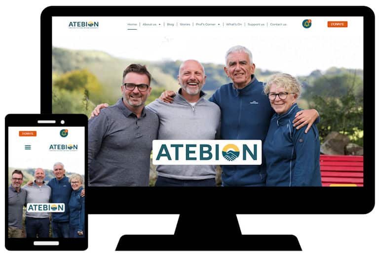
Rich Price, the founder of this not-for-profit initiative based in North Wales, which aims to help people overcome addiction, sat with me a couple of times while I made changes to this site ‘on the fly’.
We tweaked and tried and tweaked again, adding, editing and deleting content until he was happy.
Much of the content is based around blog posts, which appear on different pages and in different sections. Most posts tell the stories of people who have overcome addiction, either in the form of videos or written testimonies.
This was a great project to be involved in and proves the value of having a website – I was selected after Rich’s colleague David Clark found me via Google from his home in Australia.
As it’s a good cause, I’m providing free hosting for life.
Here’s another site which the client could see in their mind’s eye but needed help to create in WordPress.
Not all of the client’s ideas worked out and the site went through a number of iterations before the final design was agreed.
Resizing the team badge images alone took hours, but despite that this single page site was delivered for £150, plus a year’s hosting at £100 and a year’s website management for £250.

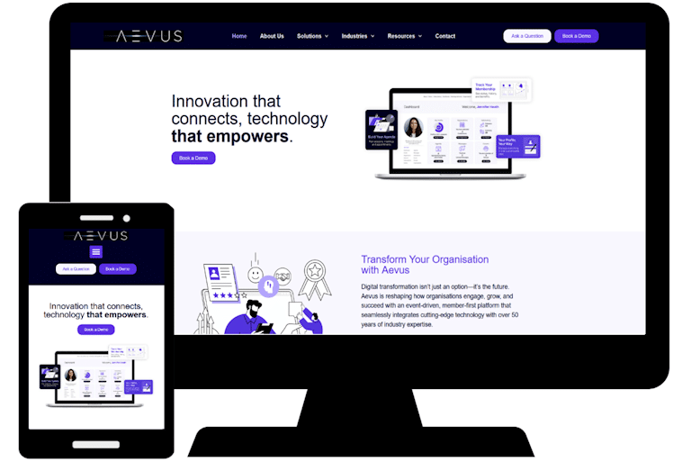
This project started as a request to recreate an existing website in WordPress. After I’d done that, the client decided they’d prefer a completely new site!
I worked with a graphic designer and a marketing specialist to create the current version.
The change of direction meant it took much longer than anticipated but, because images and texts were provided by the client, I stuck to my initial quote and delivered the site for just £750.
I constantly rail against website design companies that charge a lot and deliver little, so this project was right up my street!
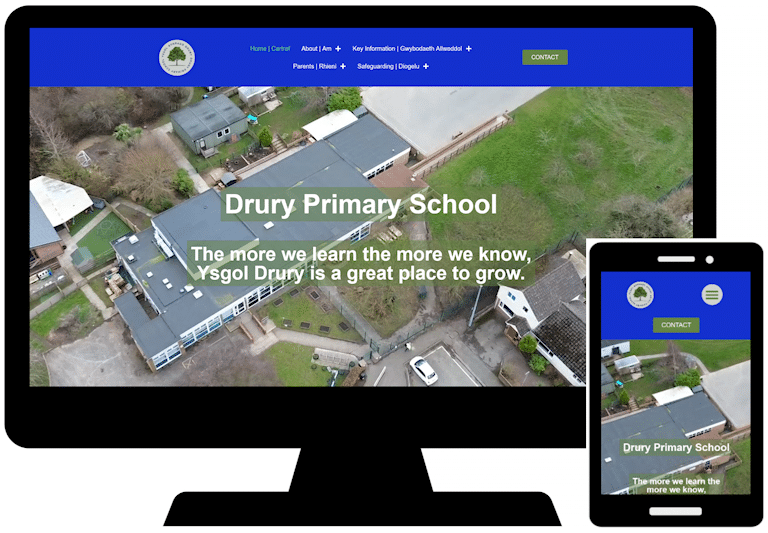
Unlike businesses, schools are legally required to have a website. Drury Primary was being charged thousands each year just to have theirs online; if they wanted any work doing, they had to pay more.
Their previous web design company was not only expensive, but hard to communicate with and it was difficult for school staff to edit the site themselves.
Working with the Headteacher and Digital Lead, I rebuilt the site in WordPress. The colours reflect those of the school logo and the design is deliberately simple, with many pages having little content which makes them easy for staff to update should they wish to.
The idea for the drone footage on the front page was inspired by another school website they saw and the video was taken by a parent.
Based in Buckley, Flintshire, Steve at Computarite has been looking after my computers for years.
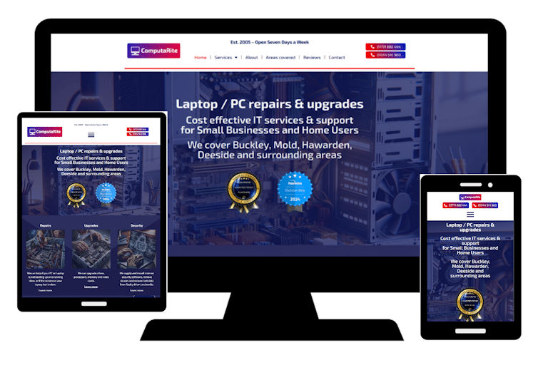
His original site was built by a mate a decade or more ago – and looked like it!
For this new version we went through a variety of colour palettes, with the dark blue theme eventually winning out.
As with all my sites, there’s now a ‘sticky’ menu at the top of the page to aid navigation, and descriptions of services are well-written and easy to read – which is not something often found on computer repair websites!
With no photos from the Computarite workshop available, I used AI to create the ‘kit’ images.
The site is now managed by the client.
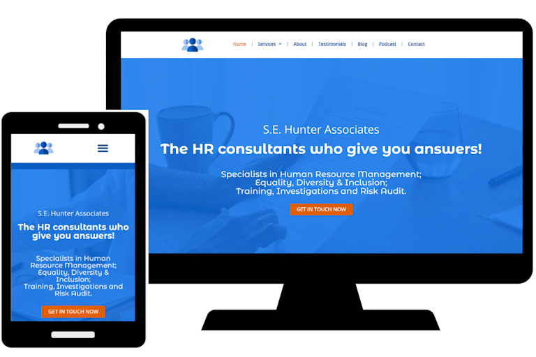
During our first conversation about their website, this client said that what makes SE Hunter Associates different from other HR consultants is that they answer questions rather than tell people to read something. So that became the key message.
The site was originally a DIY job built with Ionos, but it didn’t reflect the professional image the client wanted.
To my critical eye, information was scattered around poorly designed pages, creating a confusing picture for prospective clients.
The site is now better designed and organised, and the home page video emphasises the idea of working together.
It is, however, a work in progress, with the podcasts page still in its infancy and some better team member images long overdue.
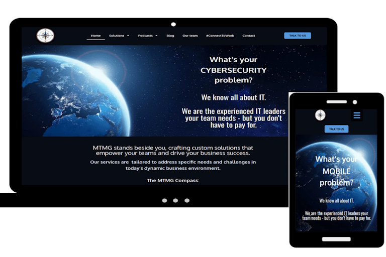
At over 90 pages, this website for a US-based client is the biggest I’ve made.
The design is based on a site originally created by the client, but which looked amateurish.
After seeking professional marketing advice which helped refine their messaging, they came to me to build a new site.
Features include a podcast player which updates automatically, and region-specific privacy statements.
As they refined their texts and images the client asked for a lot of changes, which made it a time-consuming project; but they’re great to work with and very appreciative of my efforts.
This client supplies expert witnesses.
I was recommended after they’d become disillusioned with the poor service offered by the original web designer.
One of the things that immediately struck me was the the phrase ‘expert witness’ appeared only twice on the site – in an expert’s biography and in the privacy policy!
I completely redesigned the site, improving navigation, adding visitor analytics and, of course, making sure that search engines know that the business is all about recruiting and supplying expert witnesses.

This site, for an estate planning specialist, was created from scratch.
I suggested and registered the ‘.expert’ domain and organised the hosting.
The photos of the client were taken by Raymond Jones Images. Ray also recorded the video clip, which I edited for use on the site.
Estate planning is a complex area, so the home page is intended to give an overview of the various services offered, with links to individual pages for more detailed information.
The FAQ section should grow over time!

Created some years ago in WordPress and then neglected, I’ve given this site a radical makeover.
The combination of pen and ink illustrations and professional photos commissioned by the client give the site a unique look and feel.
Texts have largely been rewritten and the blog posts are recycled from LinkedIn (after being edited by me).
I’ve also edited the talking head videos, to reduce the file size and to add or delete content.

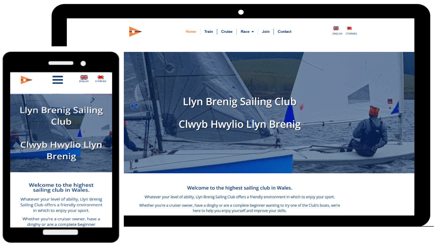
This site was originally created by the client on Wix, but they thought it didn’t reflect the professional image they wanted.
I registered the new (non-Wix) domain name, sorted out hosting and introduced a number of features to improve the site.
They include: a brief video running as background to the key message on the home page; a link on each page allowing visitors to book a call via Calendly; and a blog post page (‘Free support’) to show off the client’s articles about social media.
The Wix version of the home page took about six seconds to load; this new one takes under one second!
The site is now managed by the client.
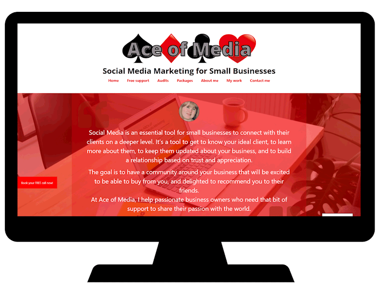
I was invited to improve this WordPress site, with the aim of attracting more people to join the sailing club.
With very little visual material to work with, I created the home page video from a number of photos.
I also produced a better version of the Club’s logo and redesigned a poster promoting an open day.
An increasing amount of the site is available in Welsh. I’ve been largely responsible for selecting texts and liaising with Helo Blod to get them translated.
Updating the site is an ongoing project, both in terms of adding / editing content and adding more material in Welsh.
This was a DIY WordPress site that I took over from the client. I transferred the domain name and hosting (saving a few hundred pounds!) and gave the site a facelift.
The client had some professional photos taken, which immediately gave the site a more personal feel.
I recommended, installed and set up the Booknetic online booking system to replace Amelia (which the client didn’t really like).
The site looks better and loads far faster than the original.
In addition, I created a new logo, business card and double-sided flyer – for a fraction of the price the client had been quoted by someone else!
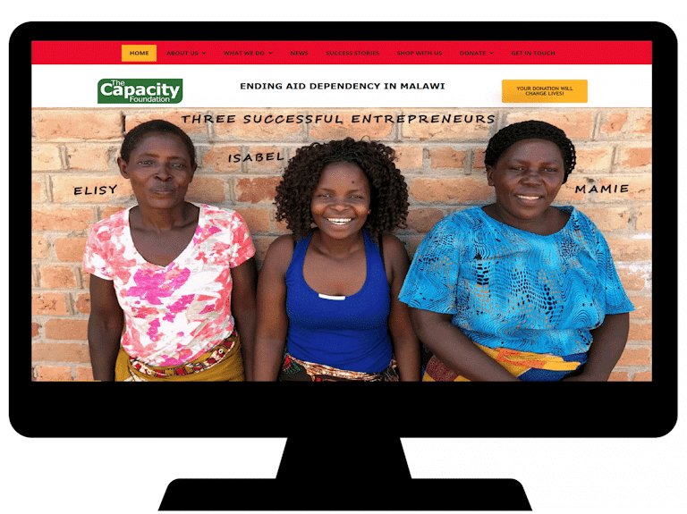
Another site that I took over from the original creator, this required significant work to update, with almost all the content being either re-written or created from scratch.
New content is added as part of the monthly support package the client subscribes to and I also manage the Foundation’s Twitter feed.
You can read more about this site on the Case Study page.
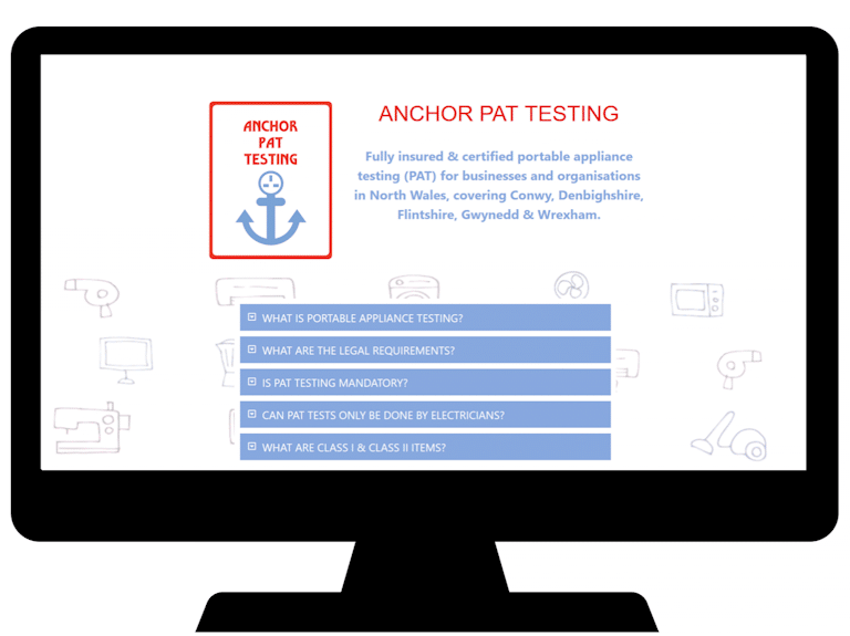
With the client desperate to launch their new service, this one-page site was created from scratch in a weekend!
I registered the domain, set up the hosting package, designed the logo, and – after a bit of background research – wrote the texts for the FAQ.
If you’d like to discuss how I can help you, please get in touch.