Note: this is an edited version of a presentation I gave to the Federation of Small Businesses (FSB) North Wales conference on 13 July 2023. The talk was illustrated with PowerPoint slides, most of which have been omitted from this post. There wasn’t enough time to say everything I wanted, so this version has some additional content.
1 – Bouncing back
Last December I had surgery for prostate cancer.
The operation left me with six incisions in my abdomen.
Four weeks ago – just six months after surgery – I ran my 29th marathon.
With nearly 4000 feet of ascent and very high humidity, it took me 5 hours and 5 minutes.
159 runners completed the race; I finished in 75th place.


The key to my success was building resilience or ‘bouncebackability’ – a term used in sport to describe recovery from a setback.
Before the operation, I identified potential weak points and decided how I’d tackle them.
A combination of pre-surgery preparations and post-surgery activities helped get me in shape, both physically and mentally.
In this session, I’ll be talking about bouncebackability for websites – how to identify weak points, get your site in shape and improve its performance.
2 – How well do you know your website?
When was the last time you took a good look at your website?
Not just a passing visit, but a long, hard, critical look.
In the last month?
The last six months?
The last year?
Hand on heart, have you ever taken a critical look at your site?
If you haven’t, you’re not alone.
Judging by the number of poor sites I see, many business owners think that simply launching their website is ‘job done’.
But if your site is slow to load, hard to navigate, out of date, short on information or difficult to read, is it really doing your business any good?
A collection of web-related statistics published earlier this year by Forbes Advisor shows that website design can influence how people perceive the business behind it.
And if you’re the business owner, then it might also influence how they see you!
Those statistics show that over a third (38%) won’t engage with a site if its layout isn’t attractive.
Over half (57%) won’t recommend a business that has a poorly designed website.
And 9 in 10 people (88%) who visit a website won’t return if their experience isn’t good.
Clearly, a website that gives people a poor experience is likely to be losing potential customers who see it and just think ‘no way’.
To avoid that response, you need to identify problem areas, by giving your site what I call an MOT – an examination that looks at a number of key issues.
By identifying areas of concern, you can decide how to improve things.
Problems vary from site to site, but examples of issues I’ve come across recently include:
- A site which is slow to load because of an image slider;
- A site where really useful information is located in a place few visitors would think to look;
- A site on which many page headings are unreadable;
- A site where the footer text on mobiles is crammed into a single, narrow column; and
- A site inviting visitors to complete a non-existent contact form.
In this session, I’ll look at four key aspects of your website that you should check – and give you some ideas about how to do so.
If you’re not confident checking the site yourself, then get someone to help you – ideally someone with a critical eye who’s able to spot problems and who’s not afraid to highlight concerns.
3 – What puts people off?
Why might visitors to your site think ‘no way’?
Issues known to influence people’s perception of a site include:
- Speed;
- Navigation;
- Readability; and
- Attractiveness.
So, let’s look at why they matter – and at what can be done if they’re a problem for your site.
3-1 Speed: how quickly does your site load?
Slow sites lose customers.
For many years, three seconds has been the target for a website to load on a desktop pc – with less than two seconds the target for an online shop.
But with both internet speeds and people’s expectations rising, many users (40%) will now leave a site that takes more than three seconds to load – and about half (47%) won’t wait for longer than two seconds.
And mobile users are also getting more impatient. According to Forbes Advisor, many now want a site to load in less than three seconds.
Of the people who leave before a site has loaded, nearly half (46%) will never try it again.
So if your site is slow to load, a significant percentage of potential visitors might just give up, try somewhere else and never return.
You can check the performance of individual web pages using a number of tools, such as GTmetrix and Google’s PageSpeed Insights.
When testing, try your site a few times, as results can vary – and test for both desktop and mobile devices.
If you’re not getting a big green A for GTmetrix or something like 100% for PageSpeed Insights, then try to find out why.
Common causes include poor quality hosting and large files.
Free or cheap hosting is invariably slow, as it usually relies on sharing resources among many websites, all competing for bandwith.
The price tag might seem attractive, but if your site is slow to load and people are turning away, is it really a bargain?
If you don’t know who’s hosting your site and what package you’ve got, then find out.
For most visitors, their first experience of your site will be the home page, so it’s important to make sure it loads quickly.
But before you rush off to upgrade your hosting package, here are some things you can do to speed things up …
i) Drop unnecessary stuff
Whether it’s images, videos, animations, fancy fonts, carousels, Twitter feeds … every element increases the size of a page, and the bigger and heavier a page is, the longer it takes to load.
Don’t think you have to cram everything on to the home page. Yes, it’s the page most people will see first.
But if it takes an age to load or to read through and visitors get tired of waiting or scrolling, then the content might not be seen at all.
Instead, aim to make it lightweight: keep only the most important content and spread the rest around other pages.
Think, for instance, about elements such as:
Images: does that photo carousel really have to be one of the first things that people see? Might it be better on its own ‘Gallery’ page instead?
Social media: why have your Twitter feed embedded on the home page? Would it not be just as useful to have it on a dedicated ‘Social media’ page – or even to just have a link to your Twitter feed?
Videos: is your home page really the best place to have five talking head videos? How about having just one, with links to the others?
ii) Make things smaller
Reduce the size of the images and videos on your home page (and elsewhere on your site) using compression software.
There are lots of tools available for cutting the size of image files. Searching online for ‘image compression software’ or ‘image optimisation software’ will find plenty of options, both free and paid.
Although using your own images can lend both novelty and authenticity to your site, the files will be large.
Depending on the settings, photos taken on a phone can vary from about 3 MB to 10 MB. They’re smaller when compressed, but can still be big and a few of them on a page will make it heavier and slower.
By contrast, professional images taken from Pexels, Shutterstock, Unsplash etc are already compressed and the files are typically about 200 KB – which is far smaller than anything taken by an amateur with a phone!
But if you do want to use your own images, try resizing them. By taking 25% off an image and reducing the number of colours used, I’ve cut file size from 10.9 MB to just 333 KB!
And if you then compress the image, you can reduce the file size even more.
You can do similar things with videos. Again, there are lots of compression utilities to choose from, so try some and see what difference they make to both file size and quality.
iii) Use magic
For anyone using WordPress, I recommend installing a plugin called WP Rocket which magically improves the performance of sites and can help get you the big green A and the 100% that you’re targeting.
Key takeaway: Play safe – aim for a load time of under 2 seconds
3-2 Navigation: is it easy for visitors to find things?
Okay, your site is nice and fast and you’ve got visitors.
But how easy is it for them to find their way around?
This is important, because if they can’t find what they want within about five seconds, almost two thirds (61%) will leave your site.
So you need to help them.
How?
By ensuring that your menus and other links are easy to see and to understand.
There’s a reason that most websites look broadly similar – the page layout of top menu, followed by content, followed by footer, is familiar.
People come to expect it, so doing anything different can throw them.
Giving people what they want, where they want it, is also why the horizontal navigation bar is the most common type.
And it’s also why so many menus essentially feature the same links – to pages labelled Products, Services, Prices, About, Contact etc.
Although your site might have some unique content that you want to highlight, remember that people tend to have certain expectations, so place your links accordingly.
Try to see your site through your customers’ eyes and ask yourself what they are likely to want to know about your business.
Make sure your menu is easy to read, easy to understand – and, of course, easy to find (sticking it to the top of the page means it will always be seen).
Remember that your main menu doesn’t need to have a link to every page on your site.
Be selective: identify your most important pages and only include those in your menu.
Links to other pages can be placed in the page footer, which is the location of choice for links that are necessary, but not what people go looking for – such as your privacy policy and terms and conditions.
It’s also worth bearing in mind that – according to research – links at the beginning and end of a menu tend to have more impact than others.
So consider placing the most important items at the start, and working through less important ones until the crucial link – at the end – to your Contact page.
Speaking of the Contact page, many sites I see have limited contact options.
People’s preferences for how they’d like to get in touch vary – I prefer email; others like contact forms; some want to phone.
Ideally, you should give visitors the choice of all three, because offering just one could stop some people getting in touch.
And if you do offer a phone number, please make it clickable. It looks so much more professional.
And avoid spam by adding Google’s reCAPTCHA to your Contact page – preferably version 3, which doesn’t require people to click squares with bikes or buses in.
Going back to your site’s navigation …
Try to keep things simple.
Don’t make people think.
And be concise – because menu items need to be easily read on mobile devices; the shorter they are, the better.
(It’s worth remembering that designing for mobile first is a good rule not only for menus, but also for other content, because working with smaller screen sizes can help you prioritise.)
Key takeaway: Make it easy for visitors to find your content
3-3 – Readability: is your content easy to read and to understand?
We’re getting there – your website speed and navigation are both good and visitors have no problem finding your content.
But can they read and understand it?
Do you know the average reading age of adults in the UK?
It’s nine.
‘The Guardian has a reading age of 14 and the Sun has a reading age of 8.
Ascento Learning & Development
It may not be by political persuasion or choice that some of your employees read what they do, it may well be it is the only thing they can read and understand.’
Bear that in mind, while I tell you that research from 2012 into the use of language in legal documents found that 80% of people preferred sentences written in clear English.
And the preference for plain English was greater among more educated people with more specialist knowledge.
So, writing in a clear, simple style should make it easier for anyone visiting your website to understand your message.
By contrast, using long sentences and complicated words can be a barrier, especially to visitors with lower reading ability, learning disabilities or whose first language isn’t English.
But it’s not only about simplifying your message.
Readability also depends on how text is presented on the screen.
I see many sites with text that is hard to read.
The reasons vary, but among the main culprits are:
- Dense sections of text with no spacing or headings;
- Text that is too large or too small;
- Fancy fonts; and
- Lack of contrast between the text and the page background.
When working with text – as with navigation – aim for clarity.
And for brevity – because the longer and more complex your texts are, the greater the chance that errors will creep in.
And you might not spot them.
So, focus on key points.
Aim to arouse someone’s interest – not tell them everything about your business or organisation.
Here’s a suggestion for you: in the coming days, go through the text passages on your site and think of how to improve their readability.
For example:
- Can a long section be broken into paragraphs?
- Would headings or bullet points make text easier to navigate?
- Does the font need changing?
- Can the contrast be improved?
And make sure that your spelling, punctuation and grammar are up to scratch.
There are plenty of people around – me included – who wince at typos, sentences that end in mid-air, and the use of the word ‘of’ instead of ‘have’.
If you need help communicating your messages in a simple, effective, way, then visit the website of the Plain English Campaign.
A quick word about contrast …
Standards for colour contrast are set out in the Web Content Accessibility Guidelines (WCAG). The requirement for text is 4.5:1 against the surrounding background colour.
To find out what this means and how to check for low contrast, visit the website of the charity Scope, which has a very useful page on colour contrast and accessibility.
Key takeaway: Be brief and clear
3-4 – Attractiveness: does your site look good?
Even if your site is fast, your navigation good and your texts easy to read, it can still be a fight to keep visitors engaged.
Studies show that people are likely to form an opinion about a website very quickly – your site probably has less than half a second to make a good impression.
If it doesn’t, then almost 40% of users will leave.
And, as mentioned earlier, almost half (48%) of website users say the look of a website is the main way they decide on the credibility of a business.
But what makes a website attractive?
Beauty is subjective, so ideas of what’s attractive will vary.
That said, following some basic design principles can increase your site’s visual appeal.
i) Colour
The colours you use are important.
Whether they’re based around your logo or inspired by something else, the colours in your scheme should work together to create an appealing effect.
Different colours evoke different responses from people, so it’s worth spending time thinking about what message you want to convey.
If you’re looking for colour ideas, there are lots of websites that will generate palettes for you.
But don’t go for too many colours – three is a good number – and use them sensibly.
For instance, just because you’ve got turquoise in your logo doesn’t mean that all your text should be that colour!
It would be better suited for use with buttons or as the background to a footer.
ii) Typography
Like colours, the fonts that you choose can influence how visitors judge your site.
Do you want to appear friendly and approachable or business-like and formal?
Do you want to be seen as modern or traditional?
Think about what message your font sends to prospective clients.
Comic Sans might be okay for a children’s party website, but it’s a no-no for a law firm.
And always remember that your font needs to be easy to read.
iii) Visuals
Photos, videos and infographics are essential for engaging people.
But they have to be high quality – because low quality content can make your site look amateurish.
There are plenty of places to get professional images and videos – either free or paid for – but will a batch of generic photos really help sell your business?
I’m not saying don’t use them – I do myself – but use them sparingly and choose lesser-used ones (Shutterstock tells you how popular an image is).
The personal touch sells, so try to use photos and videos that are unique to you and your business.
Either create your own or get them made professionally.
If it will help attract customers, then spending £200 or so on professional photos could be a good investment.
Many of you know Phil Strachan, the branding guru whose mantra is ‘brand-not-bland’.
It’s a message worth heeding – don’t let your website be let down by using bland, generic images.
Instead, try to incorporate at least some that give your site a personal flavour and help visitors see the person – or people – behind the business.
iv) White space
Try to see blank space as something positive.
There’s no good reason to cram things next to each other, so leave room between the various elements on your pages and give them space to breathe.
If your design is sound, spacing things out will make it easier for people to see your content, understand how different elements relate to each other, and help them find their way around your site.
v) Responsiveness
And a final point on design …
Your site is now fast to load, people can find and understand its content, and they like what they see.
But is everyone getting the same great experience, whatever device they’re viewing it on?
Can your carefully crafted messages be easily read on desktops, tablets and mobiles?
Do your headings overwhelm mobile users or get lost on desktops?
Are images too large or too small?
Do you have pages with so much content that mobile users have to keep scrolling and scrolling?
Remember that you can – and probably should – tweak your content for different devices.
Don’t be afraid of cutting out images or words if doing so will help mobile users.
Alternatively, you can add more content to the desktop version of your site – to maximise the opportunities that the larger screen and faster connections give you.
Whatever you choose to do, make it a conscious decision based on your experience of viewing your site on different devices.
Key takeaway: From a design perspective, get the basics right
4 – Summary
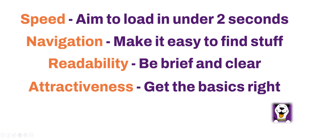
To summarise …
There are so many factors that can put people off a website that the answer to the question ‘Does your website need an MOT’ is almost certainly ‘yes’.
But whether your weak point is speed, navigation, readability or attractiveness, I trust you’re now better prepared to improve your site’s resilience in the face of increasingly demanding visitors.
‘Bouncebackability’ eh? Go for it.

